
Color is one of the most vital elements of interior design. It has the power to make a space feel lively, calming, warm, or starkly cold. Understanding how to effectively use color in your room design can significantly enhance your living space’s overall aesthetic and mood. This guide will explore the intricacies of room color design, from fundamental principles to practical applications, helping you create beautiful and harmonious spaces.
The Psychology of Color in Room Design
Before we delve into practical tips, it’s essential to understand how color affects mood and perception. Different colors evoke distinct feelings and reactions, influencing your space’s ambiance.
Blue: Calm and Serenity
Blue is often associated with tranquility and peace. It can lower heart rates and promote a sense of calm, making it an excellent choice for bedrooms and bathrooms. Shades like sky blue or soft teal can create a serene environment.
Red: Energy and Passion
Red is a powerful color that evokes strong emotions. It can increase energy levels and stimulate conversation, making it ideal for social spaces like living rooms and dining areas. However, it’s essential to use red in moderation, as too much can be overwhelming.
Yellow: Happiness and Optimism
Yellow is reminiscent of sunshine and warmth, promoting feelings of happiness and cheerfulness. It works well in kitchens and playrooms. However, soft shades of yellow are recommended, as bright can strain the eyes.
Green: Renewal and Balance
Green represents nature and renewal. It is soothing and promotes balance, making it suitable for any room. Soft greens can create a fresh, airy atmosphere, while deeper shades like emerald can add sophistication.
Neutrals: Timeless and Versatile
Neutrals, including whites, grays, and beiges, are incredibly versatile. They can create a calming backdrop that allows furniture and decor to stand out. Neutrals work well in any space and can be layered with bold accents.
Key Principles of Room Color Design
When designing a room color scheme, consider these fundamental principles to create a cohesive and visually appealing space.
1. The Color Wheel and Harmonies
Understanding the color wheel is crucial for creating a harmonious palette. The color wheel consists of primary, secondary, and tertiary colors, allowing you to select harmonious combinations effectively.
Color Harmonies
- Complementary Colors: Colors opposite each other on the color wheel, like blue and orange, create high contrast and vibrant designs. Use these for accents to draw attention.
- Analogous Colors: Colors next to each other, like blue, green, and teal, create serene and peaceful designs. This harmony is perfect for creating a cohesive look.
- Triadic Colors: Three colors evenly spaced around the color wheel create a vibrant but balanced look. For instance, red, yellow, and blue can offer dynamic combinations.
2. Consider the Room’s Purpose
The function of a room heavily influences color choice. A calm color may be ideal for a bedroom, while action-oriented colors might be appropriate for a playroom or home gym. Consider how you want to feel in each space before deciding on a color scheme.
3. Lighting Matters
Natural and artificial lighting can dramatically alter how colors appear. A room with ample natural light will make colors appear brighter and more vivid, while a darker room may take on a muted appearance. Always test paint colors in different lighting conditions before making a final decision.
4. Scale and Proportion
When working with color, consider the size of the room. Dark colors can make a space feel smaller, while light colors can create the illusion of a larger area. If you’re working with a small room, light and neutral colors are typically best.
Choosing Your Color Palette
1. Start With a Focal Point
Begin by identifying a focal point in the room, such as a piece of artwork, furniture, or architectural feature. Build your color scheme around this element to create a cohesive design.
2. The 60-30-10 Rule
For balanced color distribution, apply the 60-30-10 rule:
- 60%: Dominant color (walls or large furniture)
- 30%: Secondary color (upholstery or curtains)
- 10%: Accent color (accessories or art)
This rule helps in achieving a balanced and harmonious color layout, preventing visual clutter.
3. Create a Mood Board
To visualize your ideas, create a mood board. Gather paint swatches, fabric samples, and images that resonate with your desired aesthetic. This tangible representation of your vision will guide your decision-making process.
4. Embrace Textures and Patterns
Color is not just about paint; texture and patterns play a huge role in enhancing color schemes. Incorporate various materials such as wood, textiles, and metal finishes to create a dynamic and engaging space. For example, a mix of matte and glossy finishes can add depth and interest.
Practical Applications of Color in Different Rooms
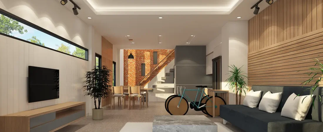
1. Living Rooms
Living rooms often serve as the home’s social hub. To create an inviting atmosphere, consider warm neutrals or earthy tones. Here are some approaches:
- Accent Walls: Paint one wall a bold shade to create a focal point without overwhelming the space.
- Layering Textures: Use throw cushions, area rugs, and curtains in varying colors and textures to add interest without clashing.
2. Bedrooms
Creating a peaceful and relaxing environment is vital for bedrooms. Soft colors like blues, greens, and lavenders can promote tranquility.
- Monochromatic Schemes: Select varying shades of one color for a serene effect, pairing dark and light hues to add depth.
- Accent Elements: Incorporate a bolder accent color in decor through bed linens, art, or throw pillows to infuse personality.
3. Kitchens
Kitchens are often filled with energy and activity, making brighter colors suitable. Consider these tips:
- Use Bright Accents: Incorporate vibrant accents through backsplashes or cabinetry without overwhelming the space.
- Maintain Freshness: Soft greens or clean whites can create a fresh, clean feel that resonates well in kitchens.
4. Bathrooms
Bathrooms are spaces for relaxation and rejuvenation. Soft, calming colors such as pale blues, greens, or neutrals create an inviting atmosphere.
- Create a Spa-like Feel: Incorporate natural hues paired with warm lighting to enhance relaxation.
- Play with Patterns: Use tiles with subtle patterns or textures to add visual interest while maintaining a tranquil environment.
5. Home Offices
Since home offices are places of productivity, choosing colors that promote focus is essential. Opt for:
- Cool Tones: Blues and greens can enhance concentration and calmness in a home office environment.
- Incorporate Inspiration: Use bold colors in accessories or artwork as motivational elements, without allowing them to distract.
Testing Your Colors
Once you’ve narrowed down your color palette, it’s crucial to test your selections before committing. Here’s how:
- Sample Paints: Purchase small samples of your chosen colors. Apply swatches on walls to see how they look at different times of the day and under various lighting conditions.
- Use Digital Tools: Many paint companies offer apps that allow you to visualize colors in your room digitally. Utilize these tools to experiment before making a decision.
Sustainable Color Choices
As an increasing number of homeowners become environmentally conscious, sustainable choices extend to color and design. Consider these eco-friendly options:
1. Low-VOC Paints
Volatile Organic Compounds (VOCs) can harm indoor air quality. Opt for low-VOC or zero-VOC paints, which are better for your health and the environment.
2. Natural Dyes
Consider fabrics dyed with natural pigments. These textiles are not only eco-friendly but also contribute to a unique, organic feel.
3. Recycled Materials
Use recycled materials and furnishings for accents, which can allow for distinctive color and texture combinations.
Conclusion
Mastering room color design can transform your living space into a haven that reflects your personality, mood, and lifestyle. By understanding the psychology of color, the principles of design, and practical applications in different spaces, you can create harmonious environments tailored to your needs.
Don’t hesitate to experiment and express your unique style through color, and remember that thoughtful choices can enhance both comfort and aesthetic appeal.
For more inspiration and tips on interior design, check out The Spruce, a trusted source for home improvement and design information.